Breaking The Ice
Why You Shouldn’t Limit Yourself to One Industry
Breaking the Ice
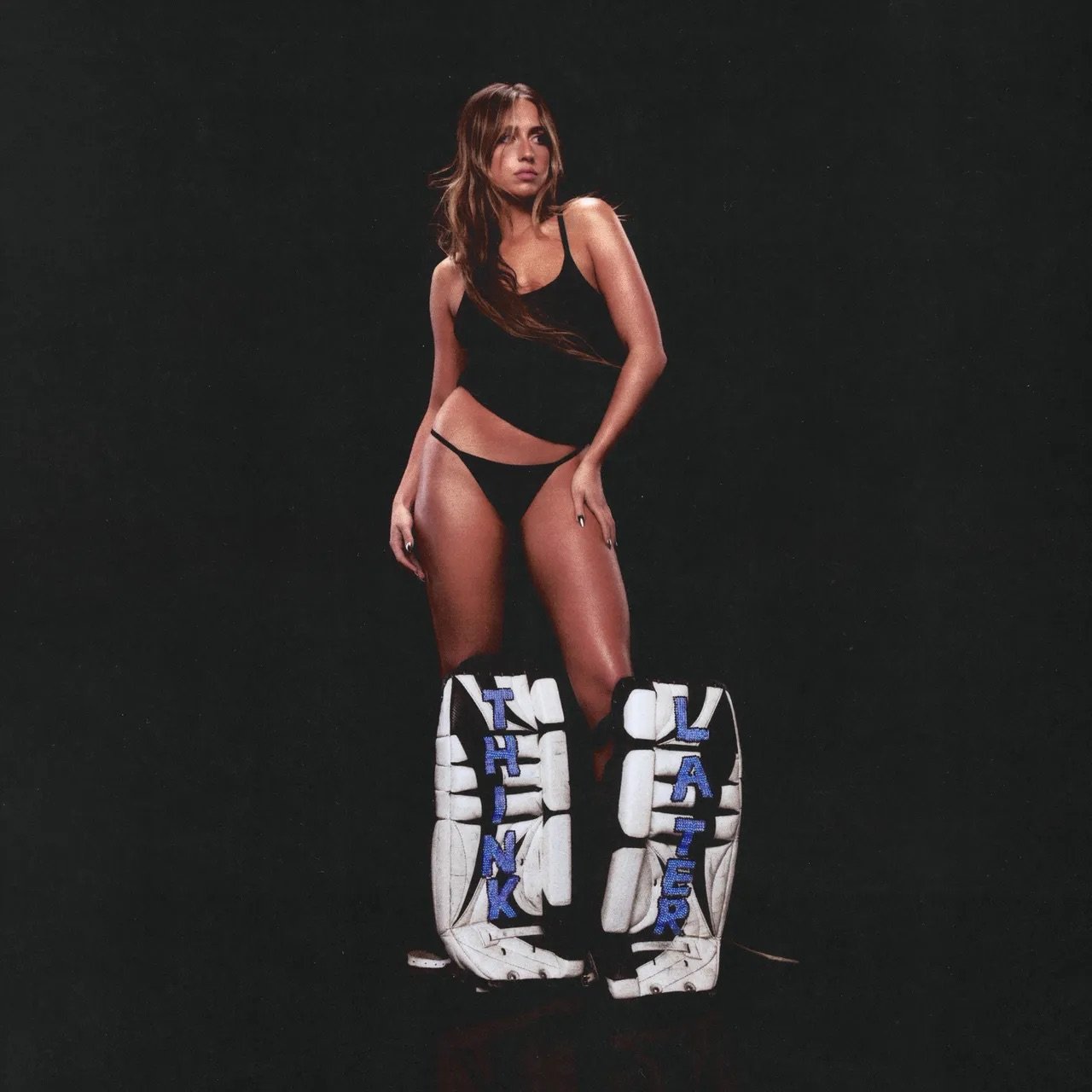
Tate McRae, the multi-talented singer, songwriter, and dancer, took an unexpected turn in her sophomore album, Think Later. Her rebranding seamlessly blends the music and sports industry into one entity. Her cover art, merchandise, packaging, music videos, photoshoots, and live performances are all recognizably “sporty.” Her new branding demonstrates the idea that certain design styles aren’t confined to specific industries – proving creativity has no boundaries. Think Later sets an example for designers as it highlights that challenging norms can open up a whole new world of possibilities.
Defining “Sporty”
Sporty has multiple definitions:
“flashy or showy in dress or behavior (of clothing) casual yet attractively stylish.”
Synonyms: Stylish, sassy“(of a car) compact and with fast acceleration.”
Synonyms: fast, speedy, zippy“fond of or good at sports.”
Synonyms: athletic, energetic, hearty
So what design elements make a brand sporty?
Sporty typefaces are bold and impactful, commonly utilized in all caps for emphasis. The use of italics adds a dynamic and "fast" feel. The characters are characterized by blocky and sharp shapes, symbolizing strength. Sporty colors are eye-catching yet maintain simplicity.
Think Later’s Sporty Branding
Tate Mcrae’s “Greedy” music video being set In a hockey rink naturally produced a typeface that had an athletic feel to it. Designer Eddie Mandell created a custom typeface for the music video, which eventually became the recognizable typeface for the whole album.
You can see the typeface is italic, bold, blocky, capitalized, and unique. When you look at this typeface without context, you might automatically think it’s for a sports team or brand.
Packaging
It’s not just the digital media that has this style; but her merchandise is completely saturated in the hockey rink.
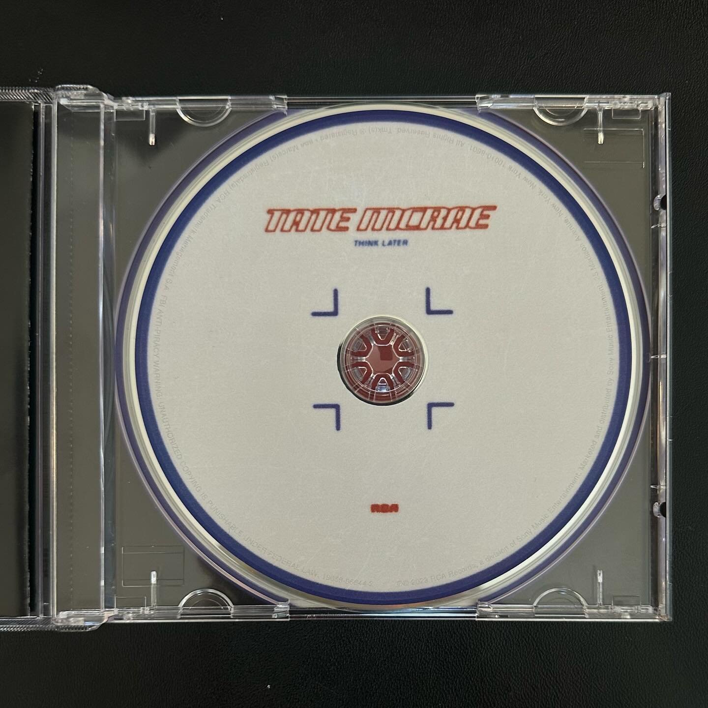
Aside from the hockey jersey merchandise, the packaging for her CD and Vinyl demonstrates just how well her team was able to combine elements from both the music and sports industries into a well thought out and unique design. Quincy Banks designed the “Think Later” CD to look like the faceoff spots on a hockey rink. It’s the perfect way to combine the two totally different realms together. Banks’ CD design is inspiring – it shows that when you think about the simple pieces you can connect two totally different things together. In this case, a simple circle was the bridge between the music industry and the Hockey world.
You’re Not Limited to One Industry
The new hockey-themed branding McRae adopted has given her many opportunities that she would not have had if her and her team hadn’t decided to go down the sports design route. In October of 2023, McRae started to hint at a partnership with the NHL, then at her album release party in December, she was pictured with a custom “Think Later” Zamboni with the NHL All-Star Logo on it. In January it was announced that McRae would be a celebrity team captain at the NHL All-Star game, as well as the headlining performance.
Without this unique crossover between sports design and music, McRae would have never had the opportunity to branch out into the hockey realm like she did. Her talents as a professional singer and dancer combined with her team’s creative choices to steer away from “normal” was a recipe for success. This just serves as proof that when you venture out and explore new styles it opens up a whole bunch of paths that will lead you to succeed on your creative journey.
Hi! I’m Chloe!
A Graphic Designer from Westchester, New York.
Let's create something extraordinary together!


