Futura Type Specimen Case Study
Project
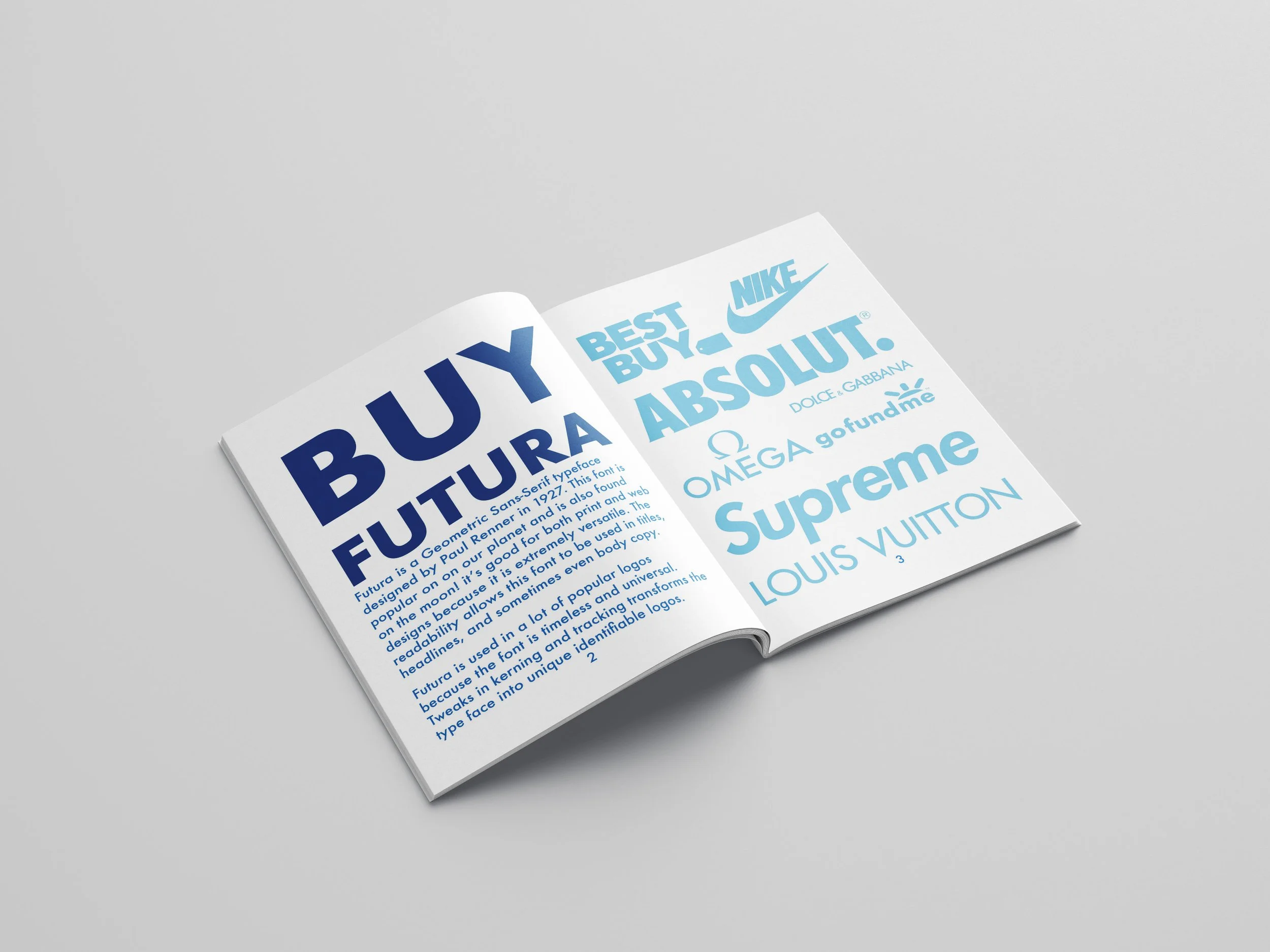
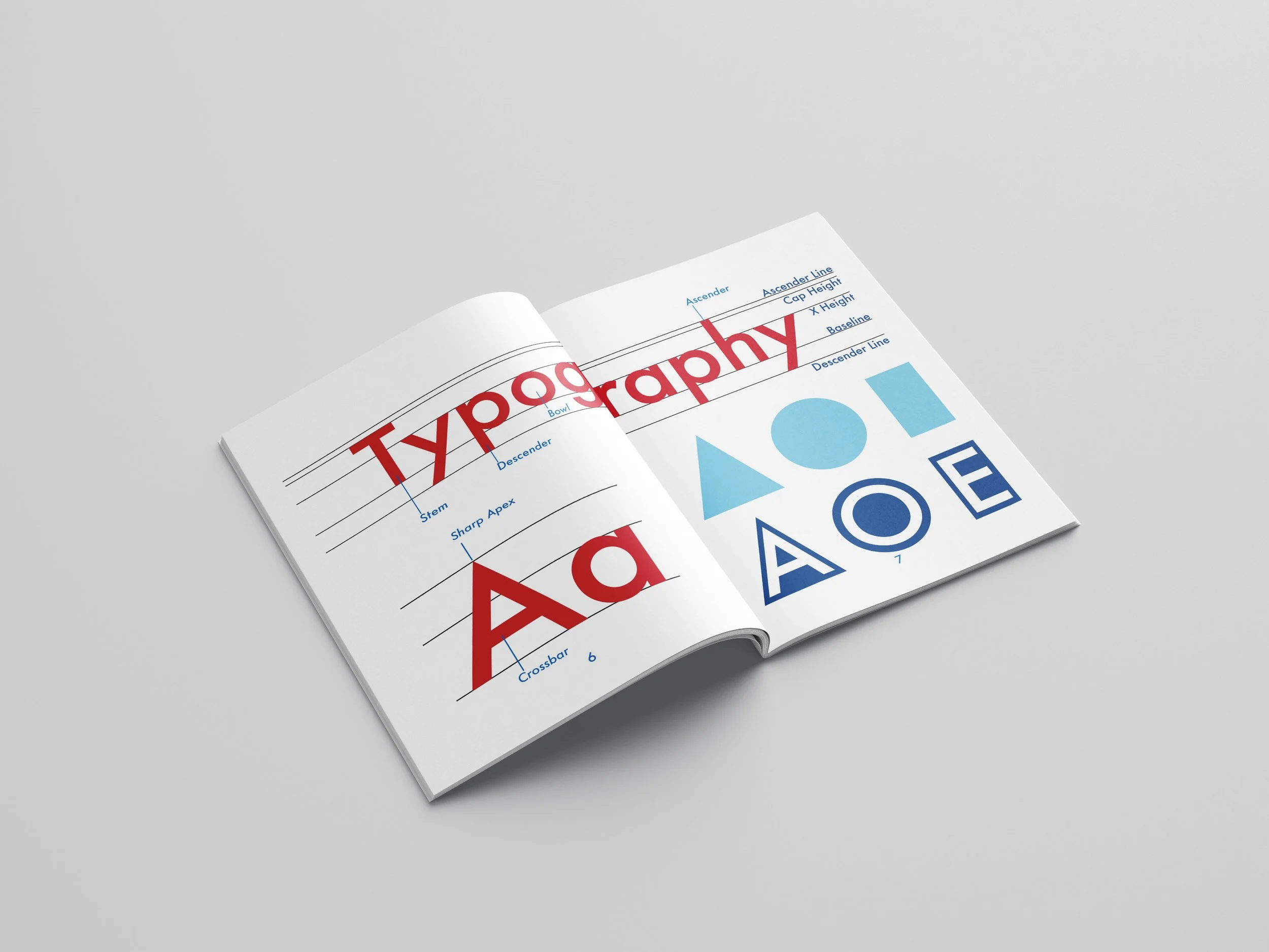
I designed a Type Specimen Booklet for the typeface Futura. This booklet highlights the typeface’s anatomy, uses, and history while showcasing it’s beauty.
Project Goals
Design a Type Specimen Booklet
Reflect the typeface’s history in the design
Design the booklet so that people will buy the typeface
Futura Research
Futura has been used in a variety of different logos and posters. It is notoriously displayed on the plaque NASA's astronauts left behind on the first moon landing.
Type Specimen Research
Color Studies
Composition 1
Margins too small
Front and back cover looks weird, looks like code, can’t tell that it is supposed to be starsAnatomy page is really fun!Paragraphs should have different line length
Feedback
Composition 2
First spread sloppyMargins too small againAnatomy page empty and boringNot enough info throughout
Feedback
Composition 3
White space / grid / layout needs to be organized betterTypography / anatomy page unorganizedLast spread before back cover could be minimized onto typography page
Feedback
Solution
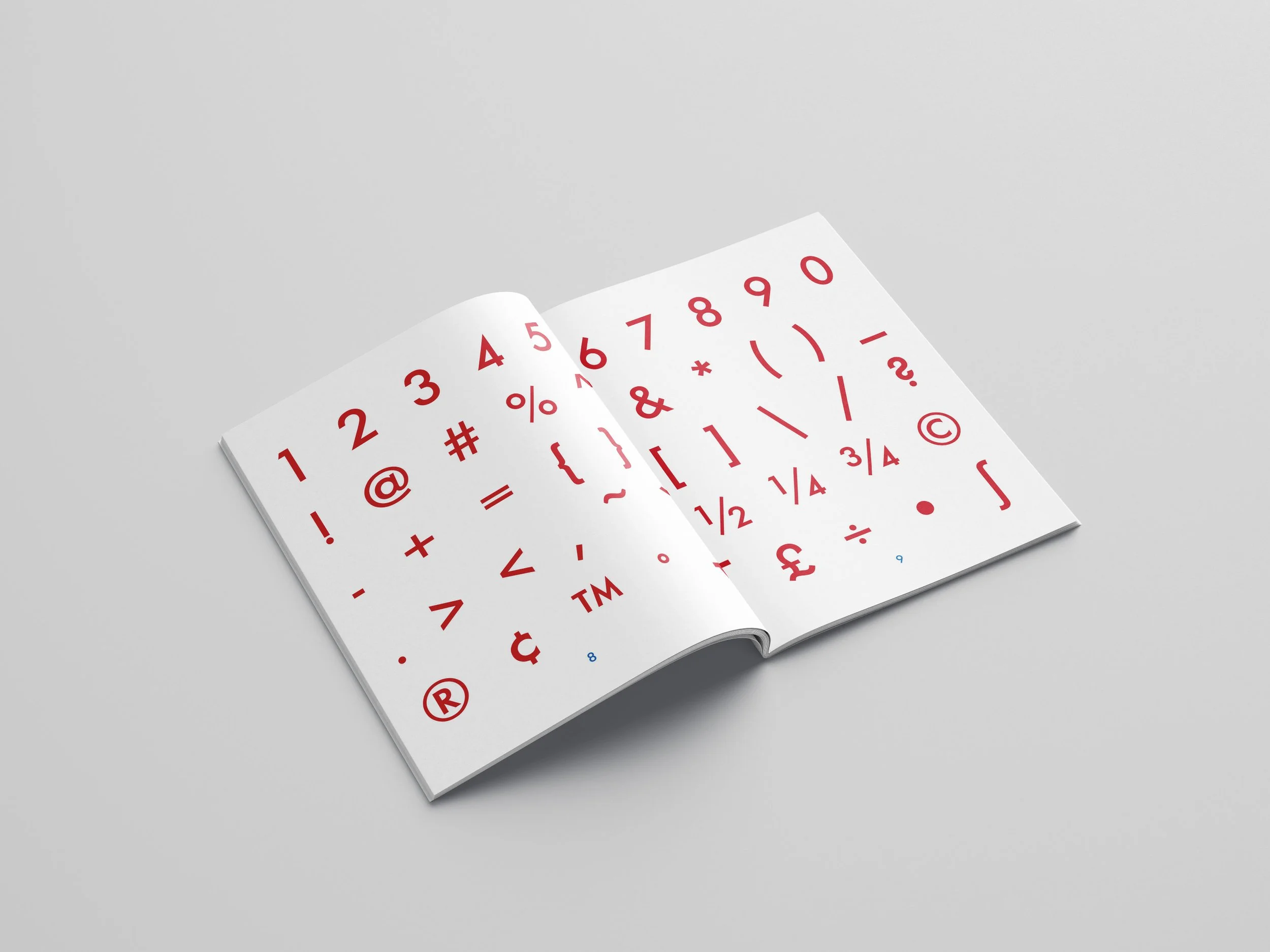
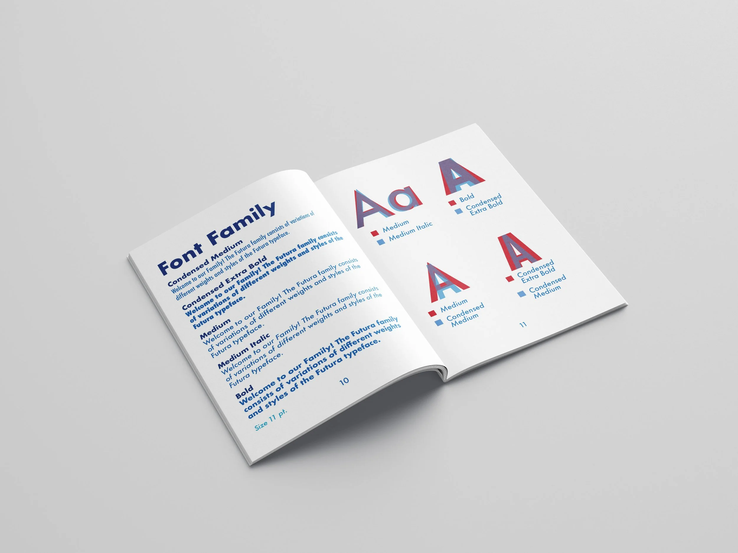
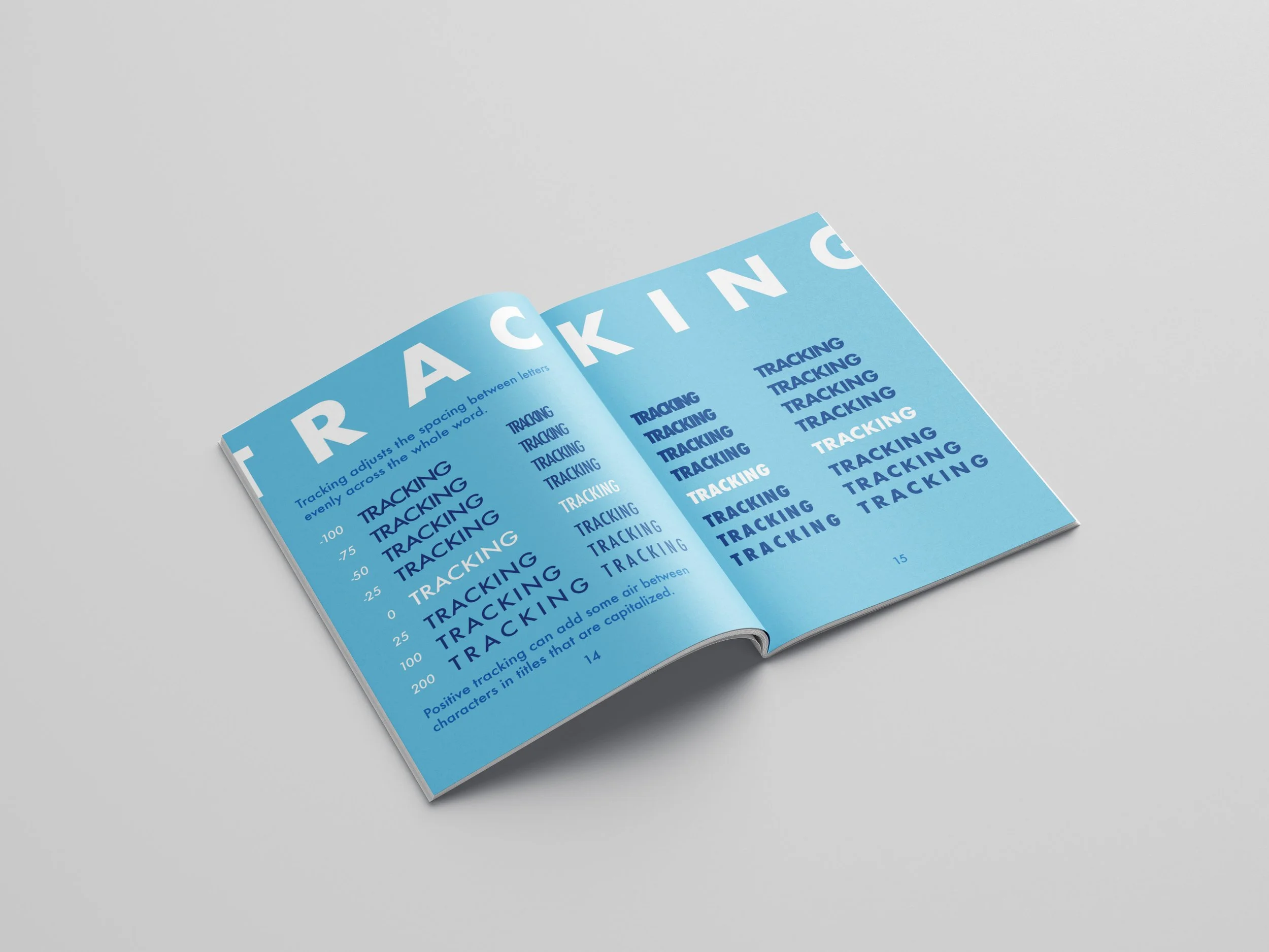
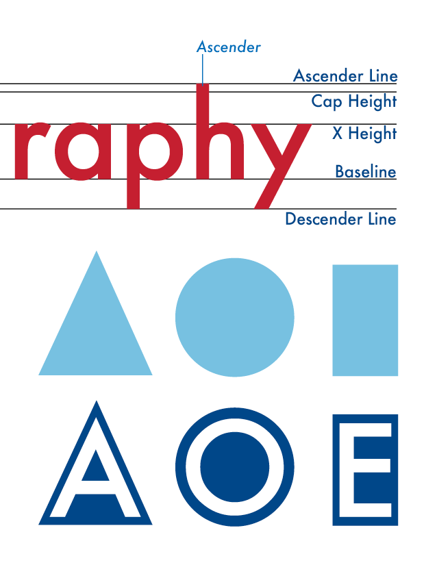
The final booklet highlights many different elements of Futura’s typeface. It showcases logos that use the typeface, a capital and lowercase alphabet, anatomy, numbers & symbols, the font family, ligatures, and different tracking examples.


