Designing Your Audience's Feelings
Partially generated using Adobe Illustrator’s Text to Vector Tool,
Prompt: "Colorful Brain made out of differently shaped elements"
What Design Elements Influence our Mood
Part of the role as a graphic designer is effectively communicating a message that will then provoke a certain emotion for the audience. Every element of a design will Influence how it makes the audience feel, think, and act. Colors, typefaces, shapes, patterns, symbols, etc. all Influence our emotions.
Happy and Friendly Design Elements
Colors associated with happiness are bright colors like yellow and orange. These colors are energetic and playful, and can remind us of sunshine. In Adobe's Guide to Color Meaning they describe yellow as a cheerful, strong color, and orange as a bright color that's full of energy. Both yellow and orange are bright enough to grab our audiences attention, yet soft enough to convey a positive tone to the design.
Happiness is also associated with round and curved shapes. Symbols like the sun or a smile are both round. Mohamed Sharaf B explains the roundess effect and why round shapes trigger positive emotions, "This is known as the “roundness effect,” which suggests that the brain processes curves more easily than angles. This effect may explain why we associate circular shapes with happiness, comfort, and friendliness."
Since round shapes trigger happy feelings, this means that bubbly fonts with curves and rounded edges are likely to elicit happiness.
Would you eat these candies if their branding looked like the ones on the right?
Elegant and Luxurious Designs
Sometimes you'll want the audience your designing for to feel a sense of sophistication, luxury, and elegance. Say you're designing a wedding invitation, or a fine dining menu. What design elements make your audience feel like something is expensive and elegant?
Purple is widely known as a color that represents wealth and luxury. Other colors may include gold or green as they signify wealth. Black may indicate sophistication while white will highlight cleanliness and purity.
A typeface can literally feel expensive. Gert Svaiko explains that serif or calligraphic typefaces with thin strokes often radiate a luxurious and elegant feeling to them.
It's obvious the option on the right would be better fit for a wedding Invitation. The first one uses the typeface bungee, which has very thick strokes and rounded corners. It also uses a sloppy handwriting that makes the card look cheesy. The second one uses a script typeface that looks and feels fancy. All of the typefaces on it have thin strokes and are neat and clean.
Chilling and Scary Design Elements
It can be hard for your design to truly make someone afraid, but it is easy to use design elements that create an eerie feeling. The creepy undertone in a design will Indicate to an audience that they should be alert and on their toes.
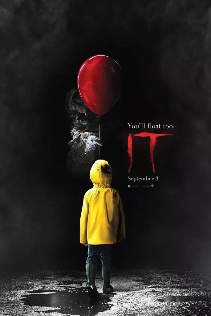
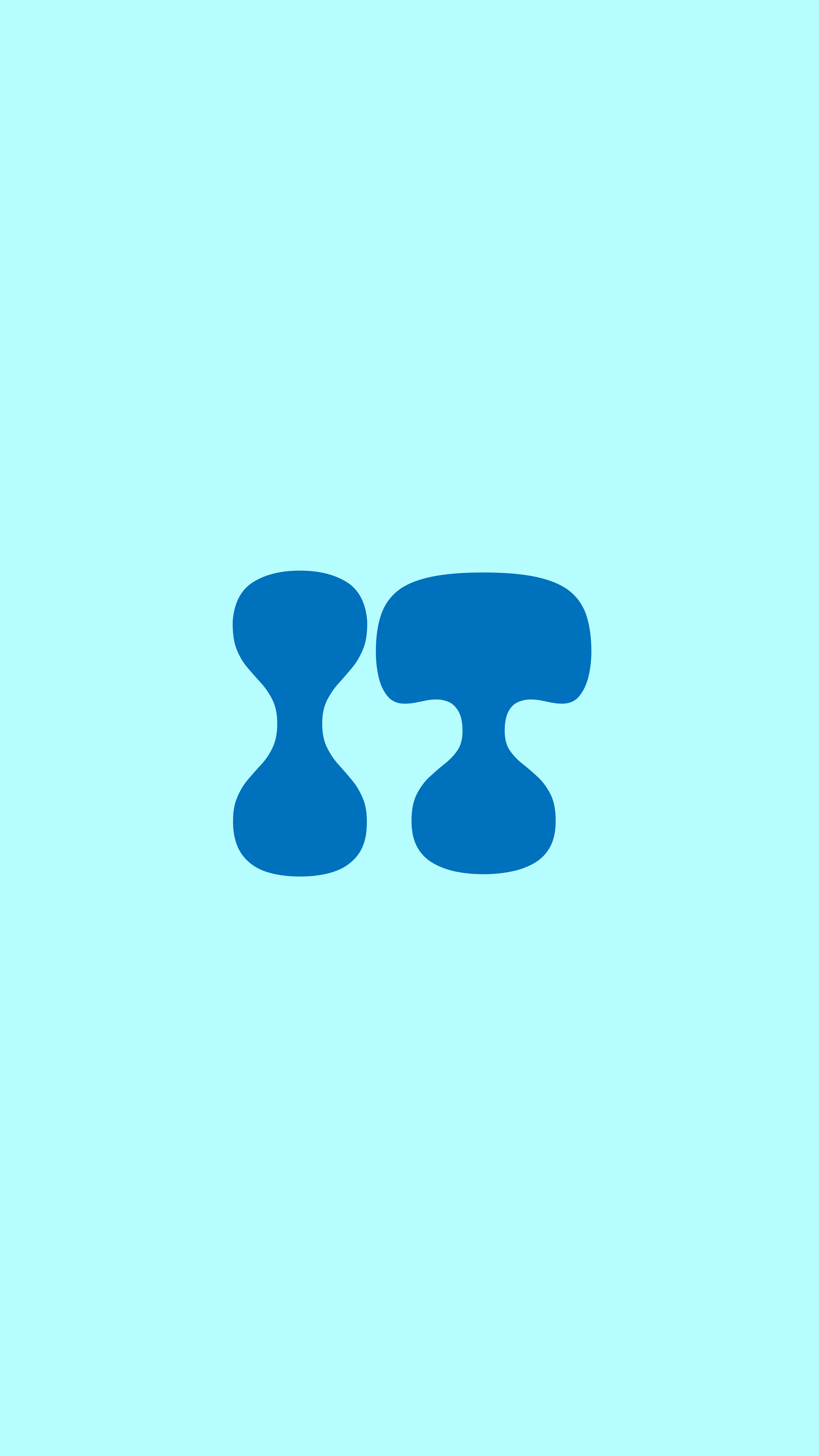
How do the two posters on the left differ from the rebranding I created on the right? Would you be scared if the It poster used the typeface and colors I provided? What about the American Horror Story one?
Dark colors are commonly associated with fear because it represents an environment that is unknown. Red is another color that can make you feel scared because it is the color of blood.
Fear can be depicted through sharp and angular shapes. The point of a knife, triangles in a spider web, and a bat's pointy wings are all examples of real things that are commonly feared that have points and angles. Riley Cullen talks about how our brains react to sharp angles, "Studies have shown that angular objects can trigger a sense of threat." He explains that sharp shapes have been proven to Increase activity in the part of your brain that processes fear.
Although Comic Sans might make your skin crawl, It Isn't a typeface that screams horror movie. It's roundness comes off as friendly and unserious.
A great typeface that has been used to signify fear is ITC Benguiat; you might recognize it from the Stranger Things logo, or the Stephen King books. The sharp serifs create an uneasy and creepy feeling.
If you want to motivate your audience to do something, a strong and prideful design might do the trick. In Sean Adam's book How Design Makes Us Think: and feel and do things, he explains Civic Pride, "Civic pride reflects a shared sense of identity and regional affiliation. It is demonstrated with the actions of local government, tribalism in sports, and public design."
Red is a great color to use if you want your audience to feel strong and prideful. it symbolizes strength, passion, and confidence, all emotions that go hand in hand with pride.
Typefaces that are bold and heavy can create a strong an powerful tone. Svaiko explains that these typefaces are assertive and loud which is why they are often seen as headlines or promotional materials as they bring in attention.
An example of bold typefaces being used to motivate people through prideful feelings can be seen In the United State's World War II posters that were used to Influence American's. These posters successfully persuaded men to join the military, and women to support the troops. They effectively created a huge sense of pride for the audience which motivated them to listen to the message being communicated.
In sports, bold typefaces can target fans to buy merchandise or tickets. This graphic announcing that the Yankees made it to the playoffs is a great example of how designers can influence actions by making them feel prideful. First, the graphic uses players In powerful positions to show their dominance. They are also glowing, making them seem godly. The word "Clinched" Is big and bold to catch the audience's attention. These kind of graphics can be used to Increase engagement on social media, Influence fans to buy merchandise, or encourage them to buy tickets to go to a game.
Our Design Choices are Crucial to Communicate the Right Message
The power to evoke emotions and Influence actions lies within our choices as a designer. No matter what you're designing, there needs to be a mood the piece is being designed around. When you can understand the psychology of how color, typography, shapes, and symbols influence a person's thoughts and feelings, then you will be able to evoke any specific emotion in your work. Detail is key, a minor detail in a design will have a huge impact on how your audience takes in the information.
Hi! I’m Chloe!
A Graphic Designer from Westchester, New York.
Let's create something extraordinary together!


