Designing Team Spirit
Unique Choices in Sports Branding
Sports Branding is a Bridge between Teams and Their Fans
When it comes to professional sports, branding represents more than just a team. The logos, colors, typefaces, etc. highlights the team's history, the city, and can be used to bring fans together, forming a strong community.
Hitting Snooze on overused Branding
There are tons of overused colors, type, and symbols when we look at sports. Blue and Red are not only the most common team colors, but they’re also commonly paired together. One reason is because they represent American history and many states' individual flags are also these colors. Another reason might be because of the psychology behind these color choices. Red is linked to aggression and intensity which can fire up athletes. Blue has a calming effect that can help players concentrate in high-pressure situations. The colors have an affect on the players, their opponents, and even the spectators. Beyond psychology, these colors also just simply look good together.
In a tweet by Jay Cuda you can see a visual representation of color schemes throughout the NHL, NFL, NBA and MLB (picture on the right). The amount of reds and blues are overwhelming to say the least.
Aside from colors, it is important for a team’s branding to have a story connecting to the team, otherwise the random choices become boring and lack depth. Fans may have a hard time resonating with a team that doesn’t represent their city and its history. A strong team logo embeds symbols to represent a story behind the team's brand.
The New York Yankees
Timeless Logo with Ties to the City
Although the New York Yankees have an overused color palette, their logo is truly magnificent. This logo is universal whether you're in New York or across the world in China, this logo is everywhere. It effectively combines the letters “N” and “Y” into one entity. Rather than seeing two letters, you see a symbol that immediately corresponds with New York. The logo is legible, no one is ever questioning what the logo says or represents. There are other teams who have combined two letters to make their logo but they just don’t do the job as effectively as the Yankees do. The N and the Y look as though they were made to fit together. You can call it luck that the letters were able to fall together so easily, but I think it was a skilled designer making great choices.
Attention to Detail in Social Media
The Yankees’ social media presence also helps them stand out. Their graphics are extremely detail oriented and you can see the direct ties they make to New York City in every single one. The graphics commonly show street signs, pictures of the city, subways, etc.
What stands out most to me is their choice of type. Sometimes they use this LED light looking typeface that glows like a sign in times square. Other times they use a typeface that represents graffiti and spray paint, like what you see all over the city.
Inter Miami Football Club
Breaking Sports Branding Norms
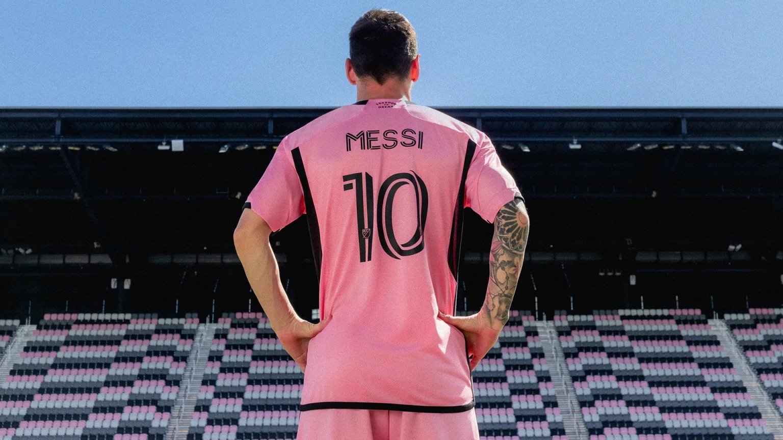
The only professional team to use the color pink in their branding is Inter Miami CF, a Men’s professional soccer team in the MLS. Not only do their Jerseys stand out, but the story behind their design decisions are impactful.
When creating the branding, David Beckam and Doubleday & Cartwright decided to go with the color pink because it represented the color of miami’s sky whether it was sunrise or sunset.
A Logo with a Deeper Meaning
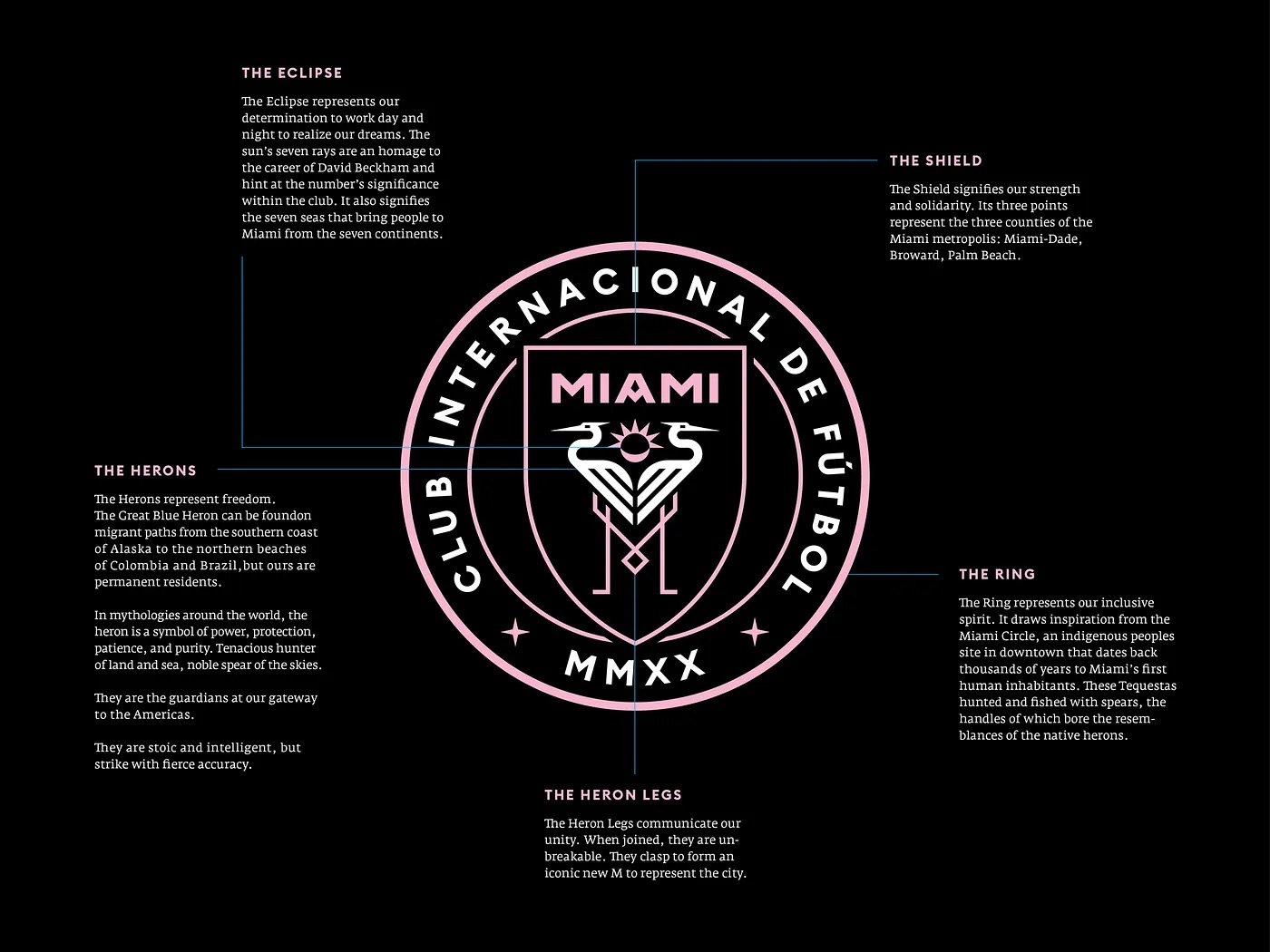
After thousands of sketches they finally came up with their logo; two white herons whose legs are positioned to form the letter M. A heron is a bird commonly found in Miami which represents freedom. The symbol between the birds is actually both a sun and a moon representing the beauty and livelihood of Miami at both night and day. Additionally there are 7 rays on the sun which represents David Beckham’s number when he played in the MLS.
Social Media
Their social media presence also stands out. While like most other sports teams they use lots of photos from games they also sprinkle in some amazing graphics throughout their posts. The templates they use for game scores, match days, starting lineups, and more add an interesting pop to the feed. Their starting lineup templates are carousel style with the first slide being an in game photo and the second slide fading out into a pink background showing the lineup.
Seattle Seahawks
A Color that Stands Out
The Seahawks have a color palette that stands out as well. Although they use the over used navy blue in their branding, they use a lime green color to effectively stand out from It. The reason these colors work so well together is because they are complementary colors; they’re on opposite sides of the color wheel. Another reason is because the lime green and Navy contrast with each other; the navy blue provides a stable foundation for the color palette while the lime green adds a vibrant energy to the brand.
Social Media
The Seahawks color palette makes it inevitable for the team to have an extremely vibrant and creative look on social media. Their social media graphics utilize their color palette to make posts that effectively match their branding and stand out from other teams. They take advantage of the lime green to highlight important pieces of the graphics.
The teams uniforms stand out so much so that they showcase what uniform combinations they’ll be wearing at their games on their social media. You can see in their uniforms that the lime green and blue tie together very nicely. No matter which uniforms they decide to wear, that eye catching lime green always brings the whole uniform together.
Pheonix Suns
Branding That Shines
While the purple and orange color combination stands out on its own, the logo and jerseys are packed with a great story. The Phoenix Suns have a branding that is extremely significant with the teams location and history. The orange as well as the team’s logo and mascot represents Arizona’s infamous heat and deserts. The brand utilizes the sun as a symbol to focus on. The ball on the jersey and the logo is both a basketball and a sun. the lines going across the shorts and the ball represent the ball’s movement while also resembling the sun’s rays. Lastly, the purple used in their uniforms helps the team stand out and compliments the bold orange to really bring out the uniform’s uniqueness.
Social Media Campaign
Salena Niemann, Manager of Creatives for the Pheonix Suns, made sure that their social media campaign for the 2023 - 2024 season would be structured perfectly. Take a look at her sketches below
The team’s social media’s graphics are eye catching to say the least. Each graphic is consistent and cohesive yet they are not these dull cookie cutter templates. Even their twitter header matches the style of the graphics, indicating they have a strong social media brand guide.
The graphics focus on the colors orange, white, and black and allow the photos of the players to add the pop of purple into the piece. Each graphic uses circles and lines as a way to draw the audiences eye in, but also to resemble the shapes of both the sun and the ball that you see In their logo. If you take a look at Salena’s sketches again, you can see a lot of these shapes and lines mapped out! It’s fascinating how every detail in this campaign has a reason for being there.
Seattle Kraken
A New Team with Historic Branding
The designers responsible for creating Seattle Kraken’s brand identity put thought into every detail of the brand. The logo, the colors, the type, all ties to seattle’s geography and history.
The team was Introduced to the NHL in 2021, yet they were able to tie their branding to the city and It's history with hockey In order to connect with potential fans.
Lisa Rice explains that the designers chose to use the “S” as a tribute to the Seattle Metropolitans; the first American club to hoist the Stanley Cup. Beyond the sport’s history in Seattle, the logo transforms the letter “S” into a something that resonates with the city itself. If you look closely you can see a tentacle in the middle of the “S” which represents the Puget Sound. The red eye transforms the “S” to represent the mythical sea monster of Norwegian waters, (and team mascot) the Kraken. The secondary logo for the team is an anchor which is a clear tie to the sea. Seattle has many strong Norwegian roots and a strong connection to the sea which is why the blue colors and the symbol of the Kraken symbols were chosen in these designs.
Making Overused Colors Stand Out
Seattle Kraken demonstrates the ability to make an overused color stand out when it comes to sports branding. Their colors consist of different shades of blue, and a vibrant Red to keep things from getting boring. The light blue color resembles an icy feeling to it and ensures that the brand isn’t dull. The four different blues they use in their branding spices things up and ensures that none of the colors feel overused; it makes the blue less boring and gives the singular shade of red some more meaning.
Social Media
Their social media graphics pull out symbols of water and the ocean as well. In their starting lineup templates ,the logo looks as though it is water. You can then see faint outlines of the logo rippling through the background as if they are waves in the sea. They use coordinates in the design as if they were navigating the sea.
Many of their graphics put that icy blue on display which really catches the audiences eye. It helps their feed add a brightness to it and prevent it from getting too boring or tiring to look at. It also helps fans feel that cold icy feeling of being at the hockey rink and allows them to connect with the posts on a deeper level.
Wow, They Look Good
While every professional sports team may have a distinctive feature in it’s branding, these teams showcase a one of a kind feature in multiple aspects of their brand. Their jerseys, social media, logos, and color scheme can all be tied together with a story of great value. Their colors allow the team to shine and be noticed. The logos are timeless, legible, memorable, symbolic, and truly connect with the fans. Their social media is able to reflect the unique branding styles in a way that is consistent and visually pleasing
Hi! I’m Chloe!
A Graphic Designer from Westchester, New York.
Let's create something extraordinary together!


