Chamberlain Coffee Package Redesign Case Study
Project
I redesigned Chamberlain Coffee’s packaging design to better resemble a high quality coffee brand while also maintaining Emma Chamberlain’s youthful and friendly persona.
Problem
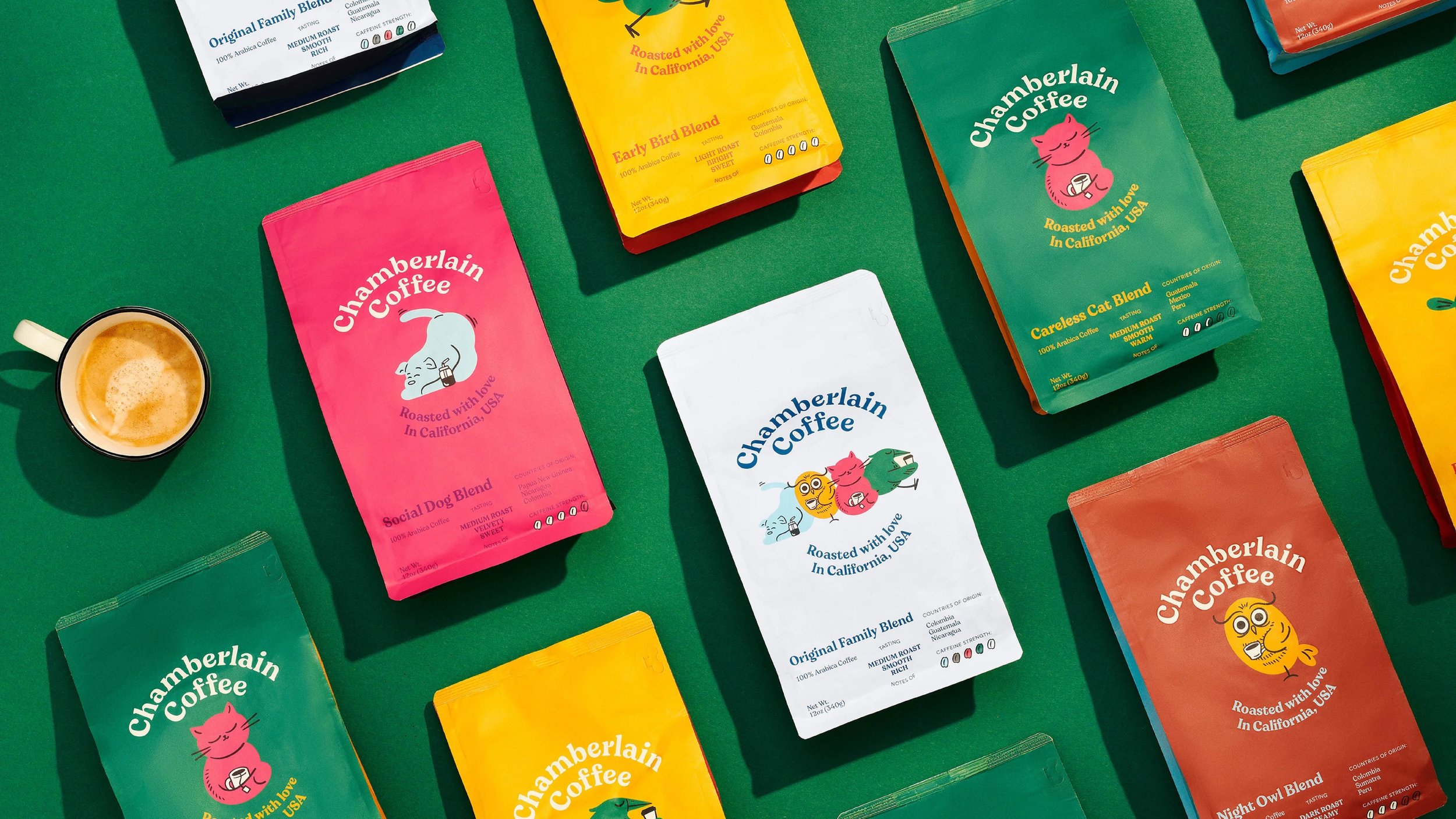
Current Packaging lacks typical branding elements associated with coffee
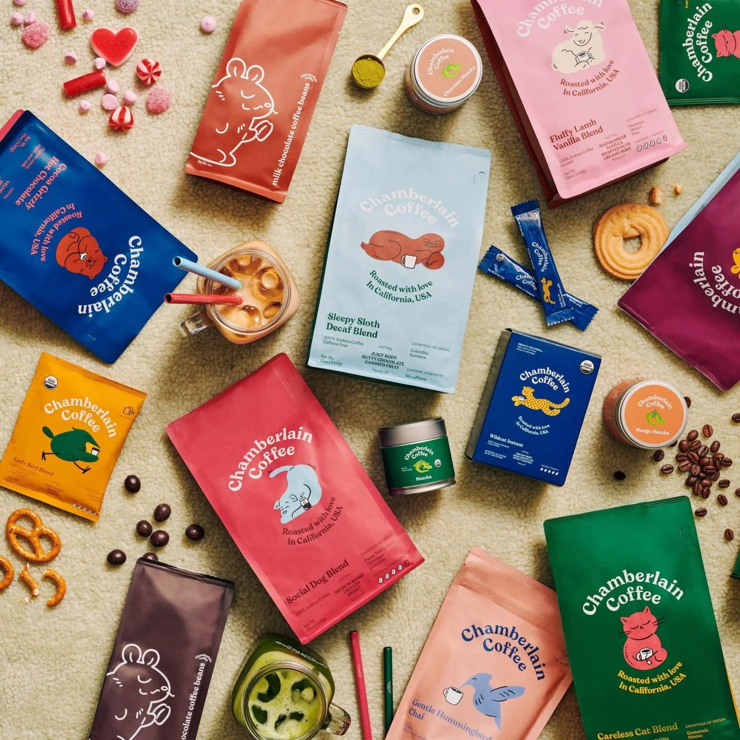
Vibrant colors and animal characters create confusion, resembling animal food or snacks
Struggle to identify the product as coffee without specific labels
Balance needed between Emma Chamberlain’s playful branding and sophisticated high-quality coffee presentation
Important to maintain connection with Emma Chamberlain's fan base while appealing to a wider coffee lover audience
Achieve a balance between playful and sophisticated branding for Chamberlain Coffee
Expand the customer base by attracting individuals who take coffee seriously through sophisticated branding
Maintain connection with loyal fans by incorporating playful elements into the branding and product experience
Develop a new design that ensures instant recognition as a coffee brand
Project Goals
Market Research
Chamberlain Coffee Brand Research
Chamberlain Coffee’s branding was designed by KontrapunktTarget Audience
Gen Z
Female
Emma Chamberlain fans
Coffee Lovers
Mainly from US
Type Studies
Wunderpunkt is a custom typeface designed specifically for Chamberlain Coffee.Color Studies
Each swatch is directly from Chamberlain Coffee's current branding.Composition 1
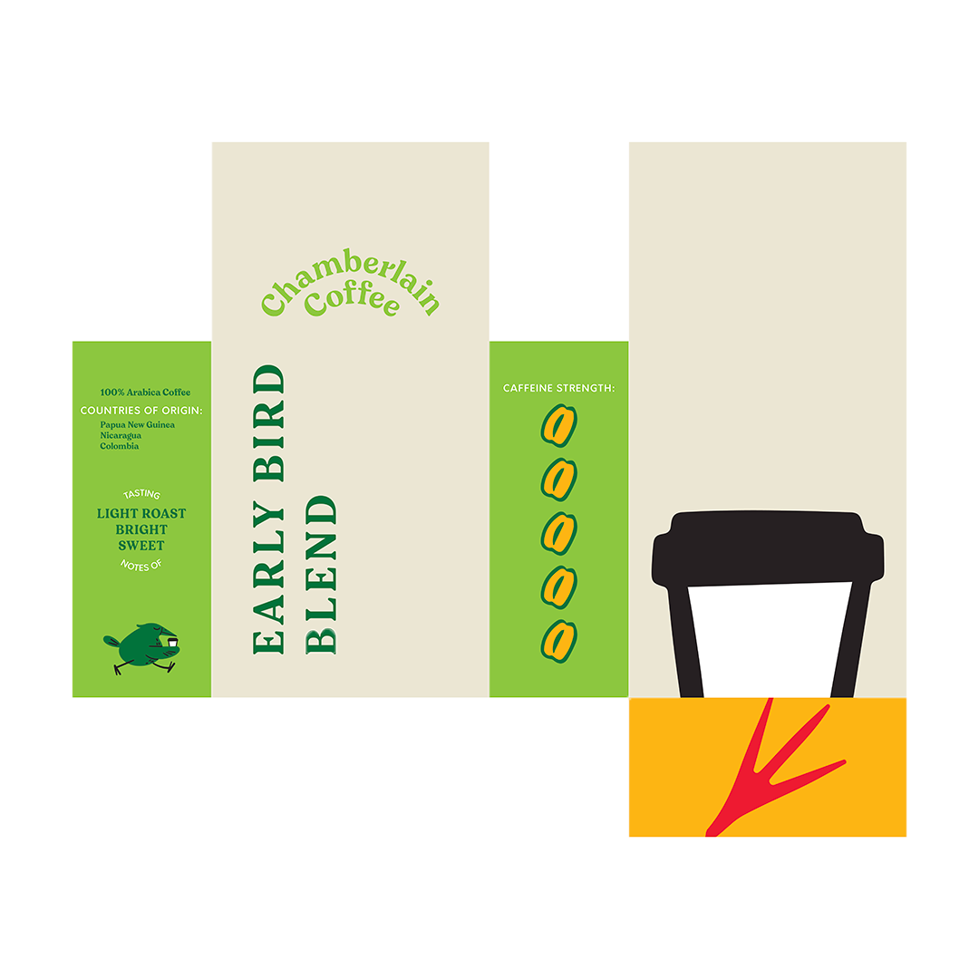
Back is hard to read & lots of empty space at top
Some elements are still too close to the current branding, feels like not much changed
Don’t like dog above logo
Paw print at bottom is nice touch
Gradient look like coffee, makes it hard to read though
Feedback
Composition 2
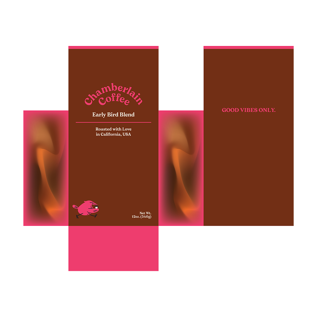
Sideways text isn’t balanced with logo
some elements are still too close to the current branding, feels like not much changed
logo too light, maybe try creating a whole new logo
Feedback
Composition 3
Missing info
Use less Wunderpunkt
Too much pink, maybe try to create a pattern for an added touch instead of using the vibrant color
Like the idea of the gradient but it is too extreme, especially with pink
Feedback
Solution
The solution I came up with successfully balanced sophistication with playfulness to attract to both serious coffee enthusiasts while maintaining a connection to Chamberlain’s current demographic


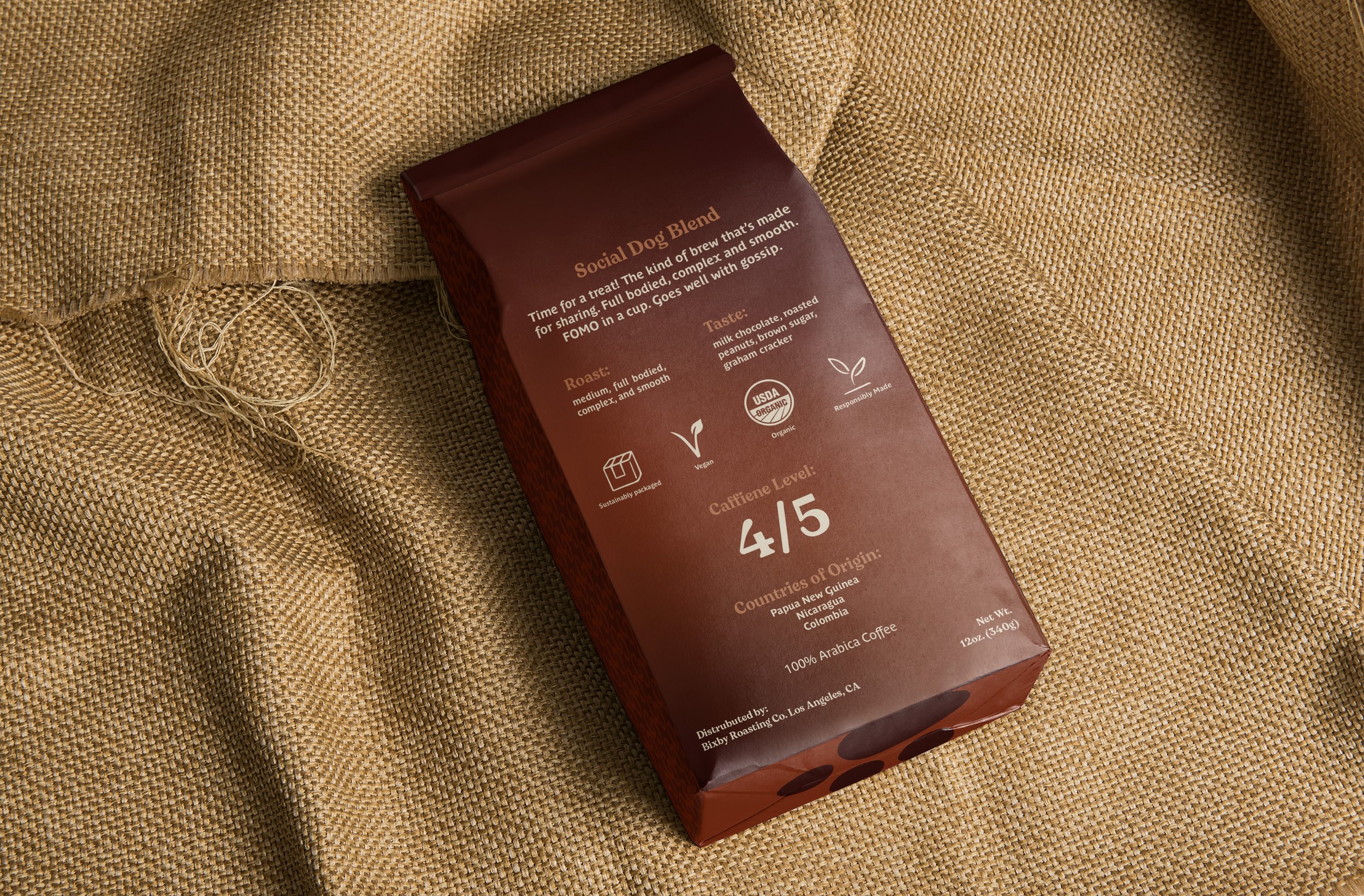

I used Parisine Plus as the logotype and paragraph type because it is clean and sophisticated yet still has a pinch of that fun and playful energy to it. I maintained some branding consistency by using the Wunderpunkt typeface for certain elements like headings and titles.
Monochromatic brown color palette to keep a consistent and sophisticated feel to the brand.
The pattern I designed using the C from the Wunderpunkt typeface.
Typography
I went with a Monochromatic brown color palette to keep a consistent and sophisticated feel to the brand. The vibrant colors were too distracting and misleading.
The colors here allow for the product to be more easily recognized as a coffee packaging.
I used a softer gradient so that legibility was easier.
Colors
I designed the pattern on the sides and top of the packaging using the “C” from the Wunderpunkt typeface which was also previously seen in the brand’s logo.
This allowed for me to keep a recognizable element between the new branding and existing customers.
Pattern
Since I decided to get rid of the animal characters I had to create a connection between the name of the flavors and the branding. I kept the paw print I designed at the bottom of the packaging that way the brand can still use animals for their flavor names without it seeming completely random.
Mascot

