Chloe Pagnozzi Branding Case Study
Project
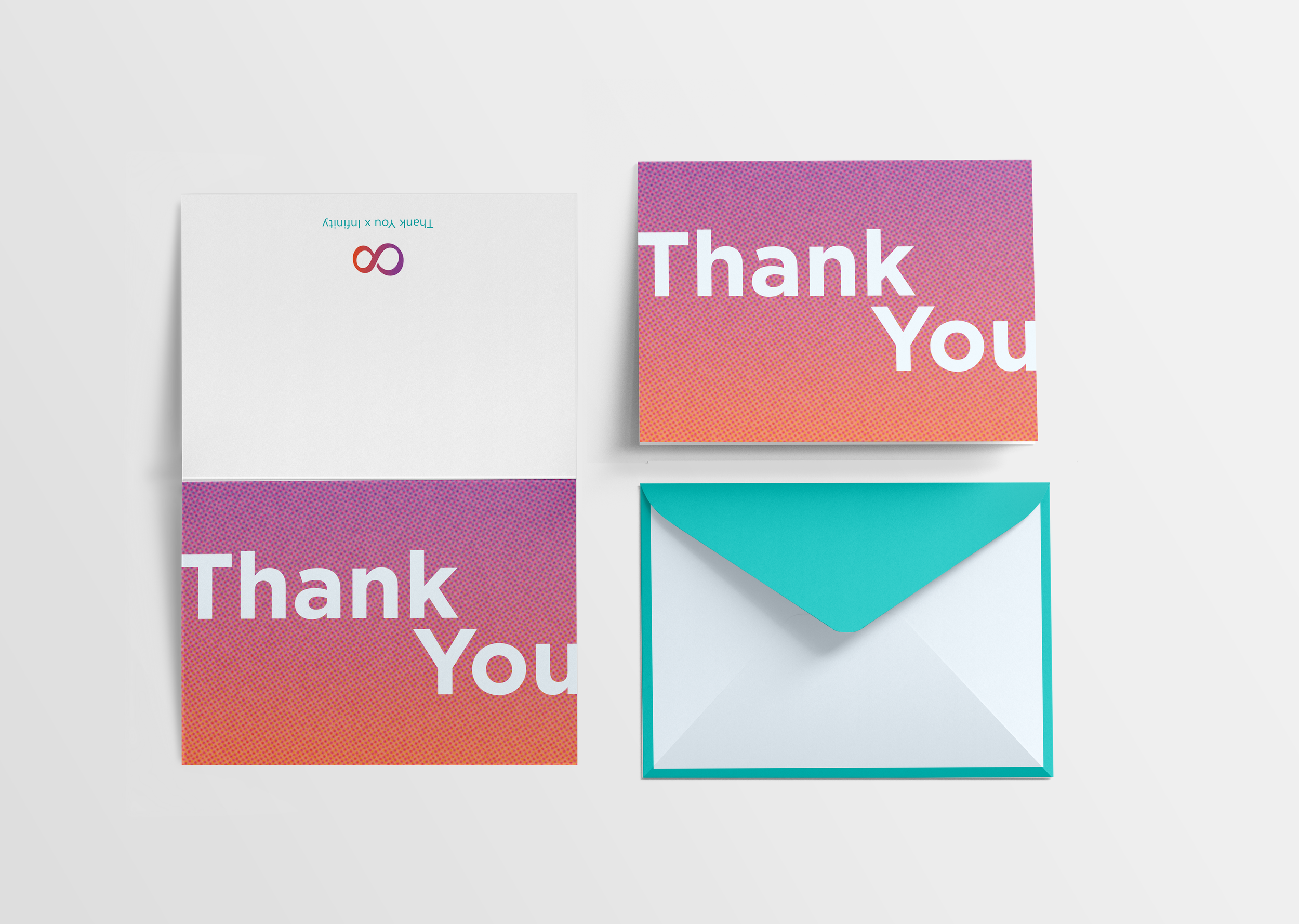
I upgraded my personal branding and created a brand kit so that I could have a consistent style to my identity as a graphic designer. I also created a brand system so that I have branded resources ready for when I need them.
Project Goals
Design a professional and clean logo
Create a consistent brand identity
Showcase energetic, happy personality in my personal branding
Color Palette, Type system, brand kit
Mood Board
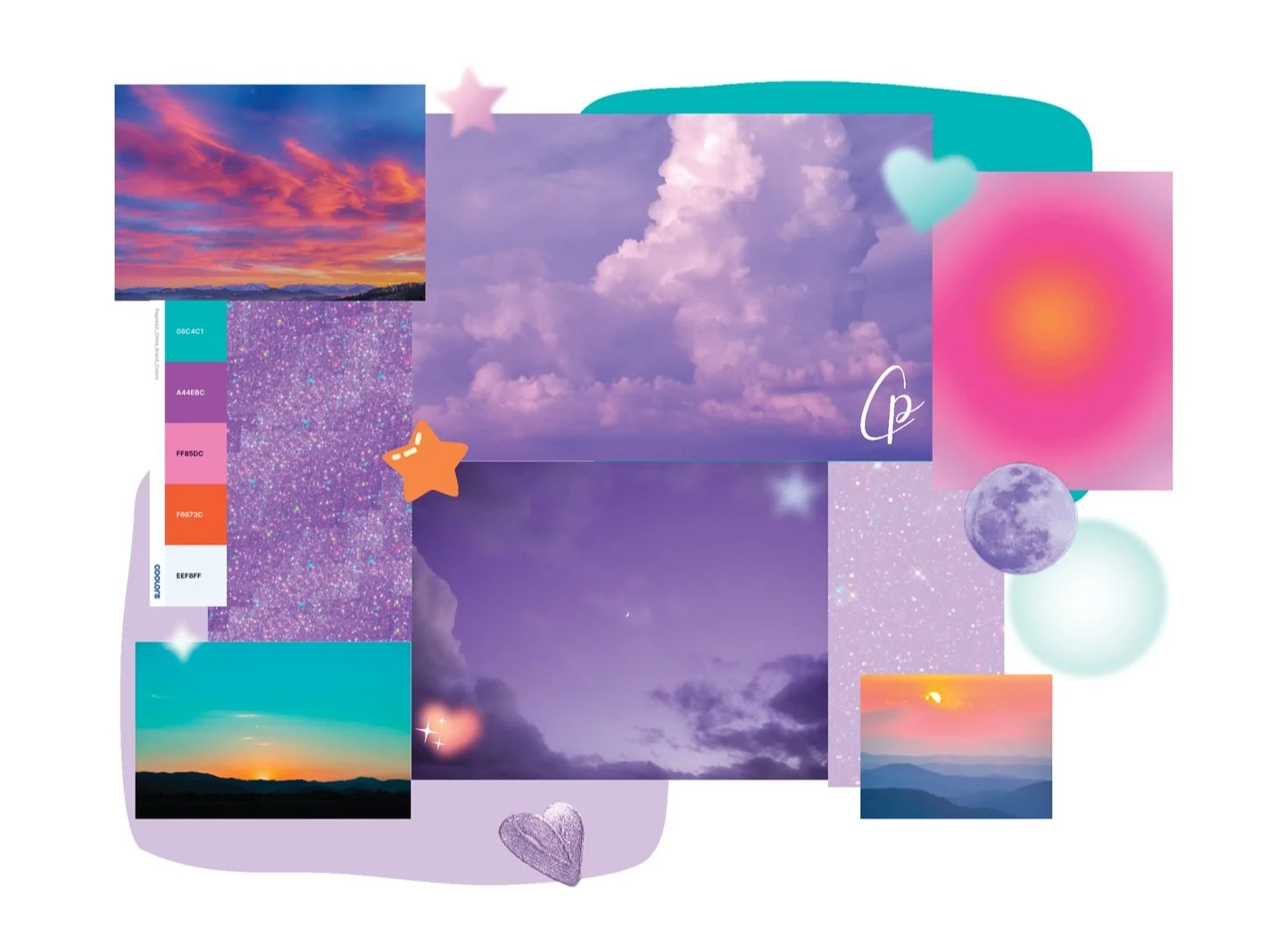
I was drawn to photos of the sky. I like the starry nights but I also loved the photos of sunsets.
To me the sky represents infinite possibilities, which inspired my brand all together.
Logo
Sketches
Concepts
Solution
Logo
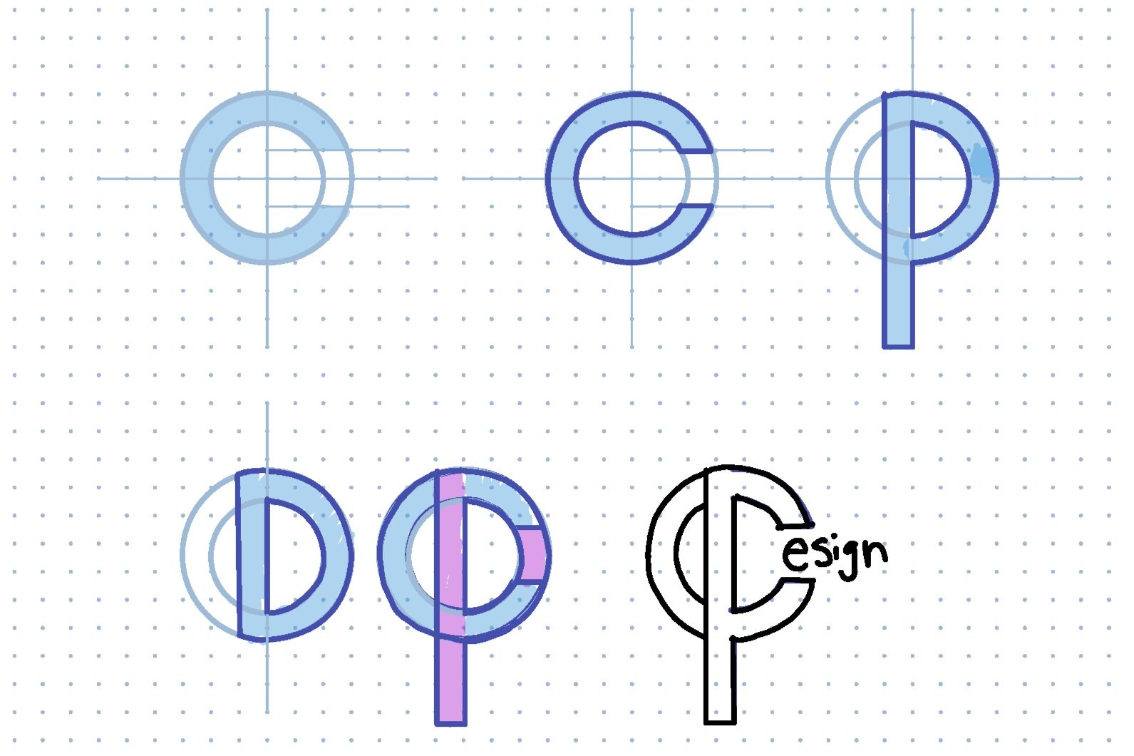
My final logo is an infinity symbol to represent that there are infinite design solutions and that the sky is the limit. The logo also represents my initials C and P, the gradient helps your eye read it as CP while also keeping the design flowing all together as one.
Type faces
I experimented with a few different typefaces and finally landed on using the Gotham bold, Gotham medium and Gotham book.
Gotham is a geometric sans-serif, and a universal typeface. I thought this further reflected the “infinite possibilities” idea; as this one typeface has been used for so many different things. Gotham is clean and sophisticated, round and friendly, and bold and assertive.
Colors
I based my final color palette on the colors of sunsets I found for my mood board. I used Adobe Color and Coolers.co to experiment with color combinations.
Stationary


