Social Media Campaign: QTHON 2024 Case Study





QTHON
QTHON is a student-led philanthropic effort at Quinnipiac University that raises funds and awareness for the patients and families at Connecticut Children's.
I was fortunate enough to be the Creative Development Chair for QTHON from 2021 until 2024! My role was to be in charge of all creative aspects of our organization.
Project Overscope
Each year QTHON’s Communications Team comes up with a new social media campaign and theme. The year-long campaign began in April 2023 and concluded in March 2024.
QTHON 2024’s social media campaign was a huge success!
Problem
QTHON’s profile has lacked recent and relevant photos since before the Pandemic hit. Many posts were just text on a screen rather than any picture at all. This created a huge disconnect with our audience and discouraged people from following and engaging.
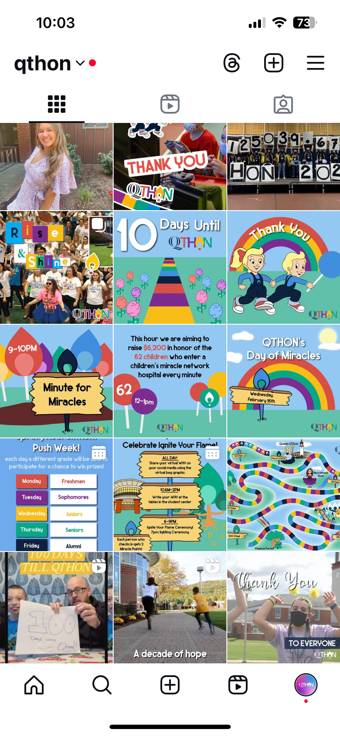
QTHON 2022 Campaign
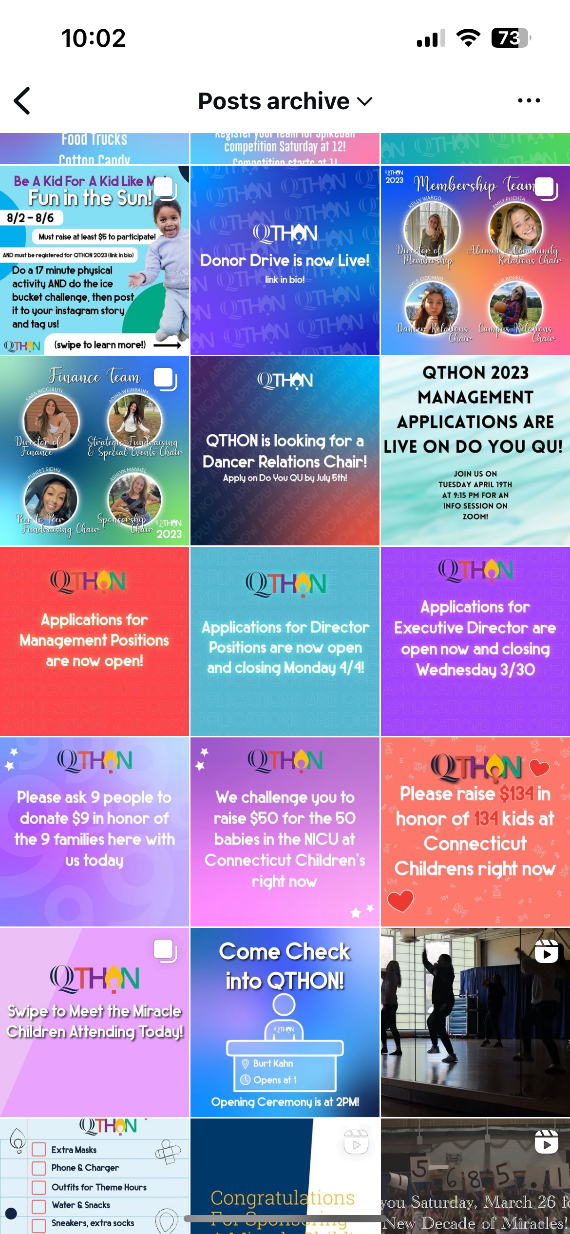
QTHON 2022 Campaign
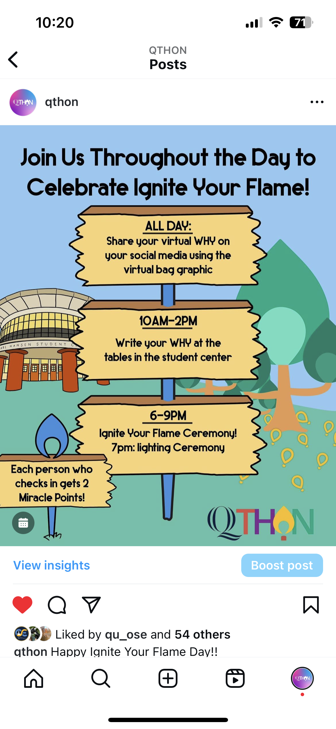
QTHON 2022 Campaign
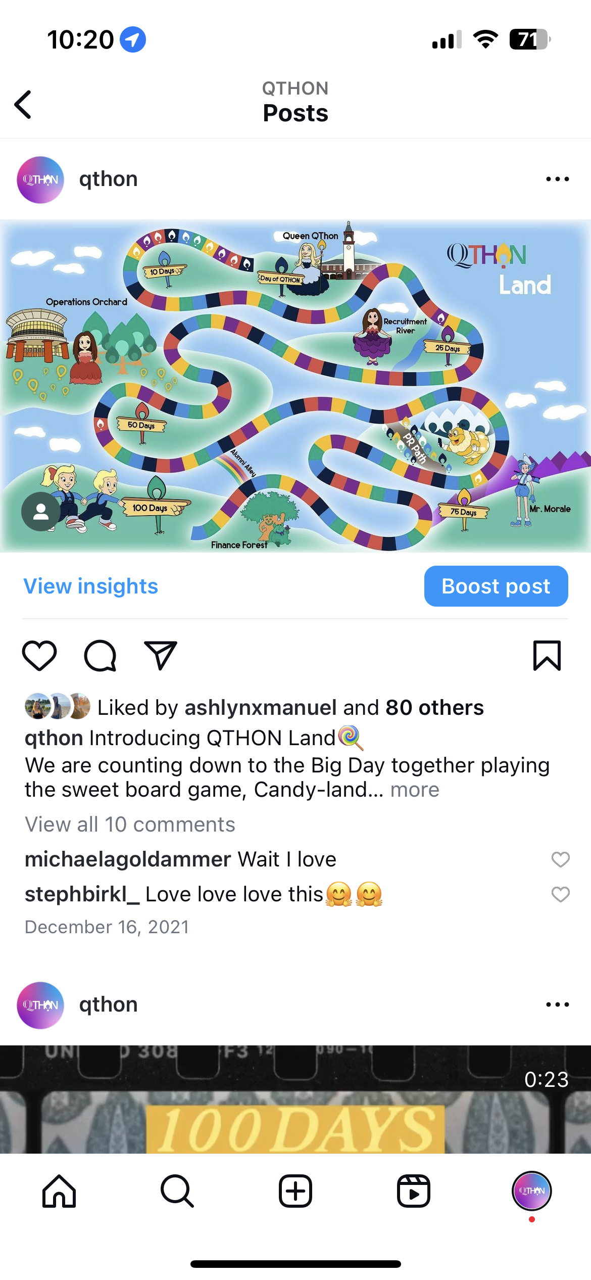
QTHON 2022 Campaign
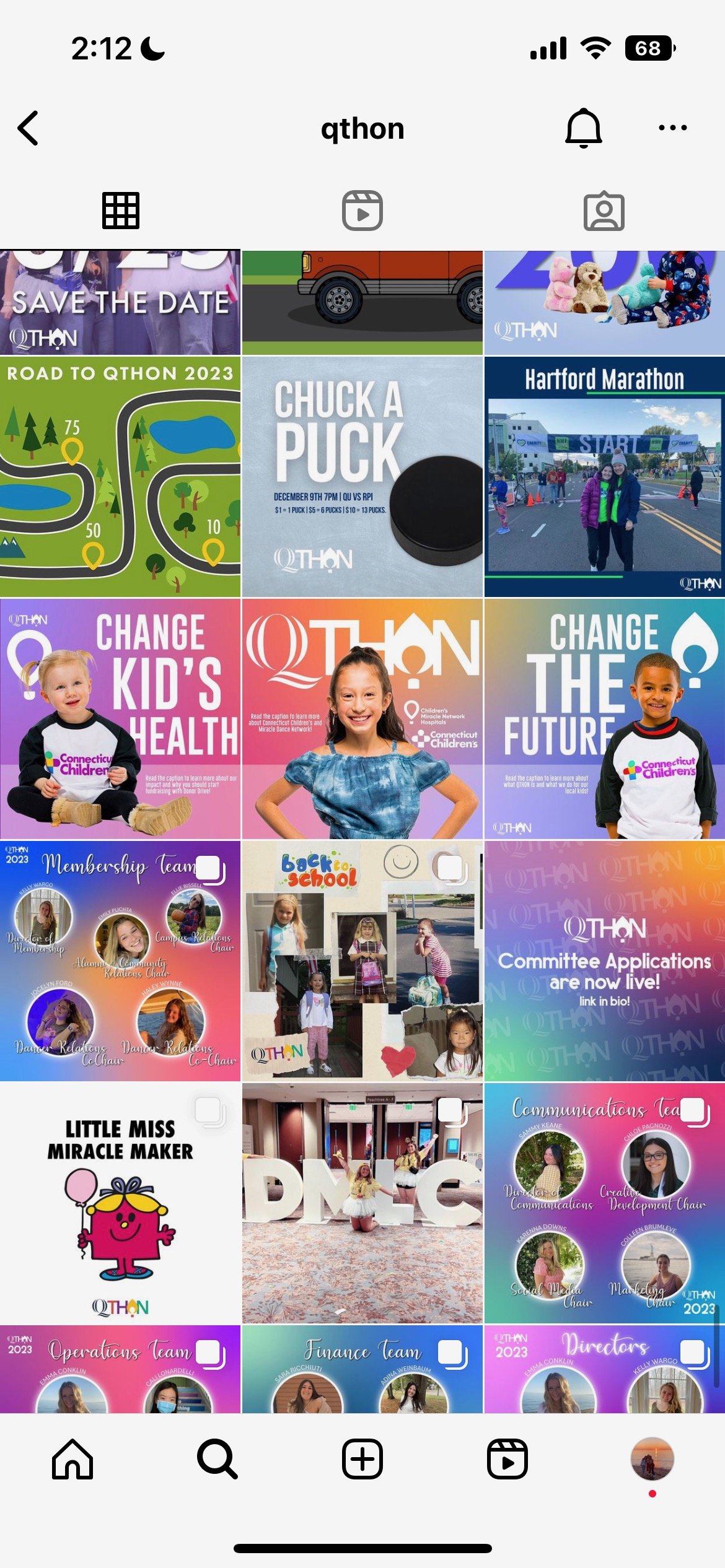
QTHON 2023 Campaign
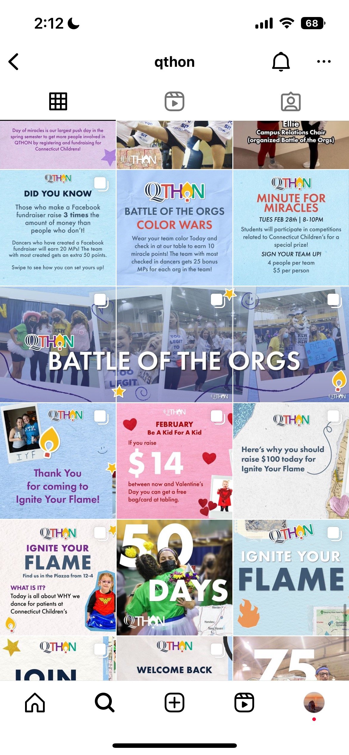
QTHON 2023 Campaign
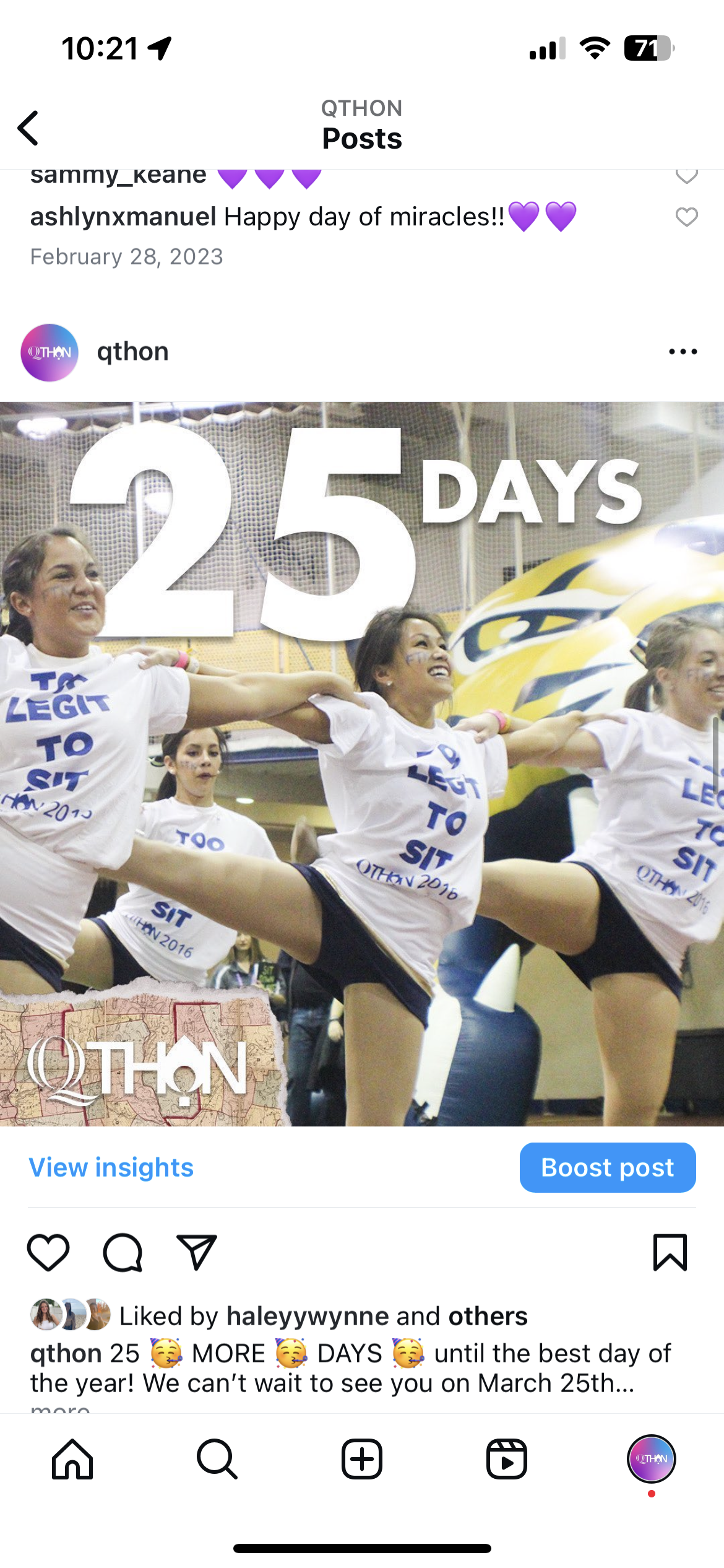
QTHON 2023 Campaign
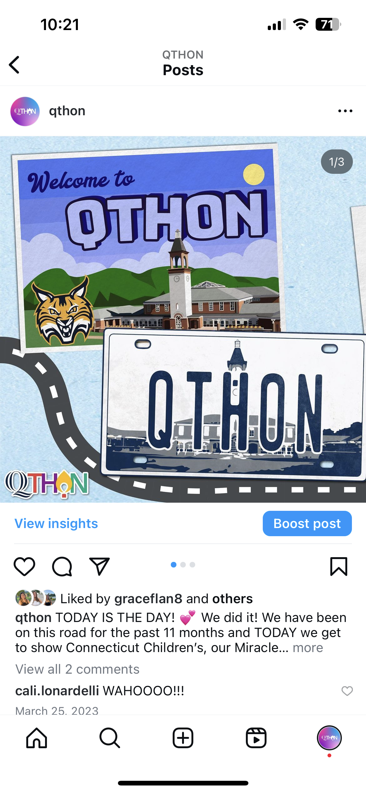
QTHON 2023 Campaign
Project Goals
Increase Instagram followers by 20% (April 2023 - March 2024)
Increase audience engagement
Transition from type focused posts to picture focused posts, and ensure all photos are recent
Overall we would like our social media page to bring in new participants, encourage more people to attend events, and get people to fundraise for QTHON
Campaign Research and Brainstorming
The Communications Team and I looked at other Dance Marathon’s and other Quinnipiac Organization’s Instagram. Our research gave us inspiration for our feed’s theme and for different post topics.
Our Plan
New profile picture
New highlight covers
New slogan
Create templates
Take photos at all events
Social Media Branding
Colors:
2024 Campaign Slogan
“Together We Will …”
Profile Picture
Templates
I created templates in Canva and uploaded our branding so that graphics could be made faster and remain consistent. This came in handy because other members of the Communications Team could make graphics if something needed to be changed or made at the last minute.
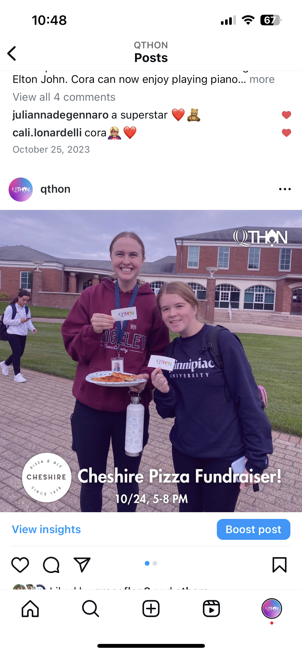
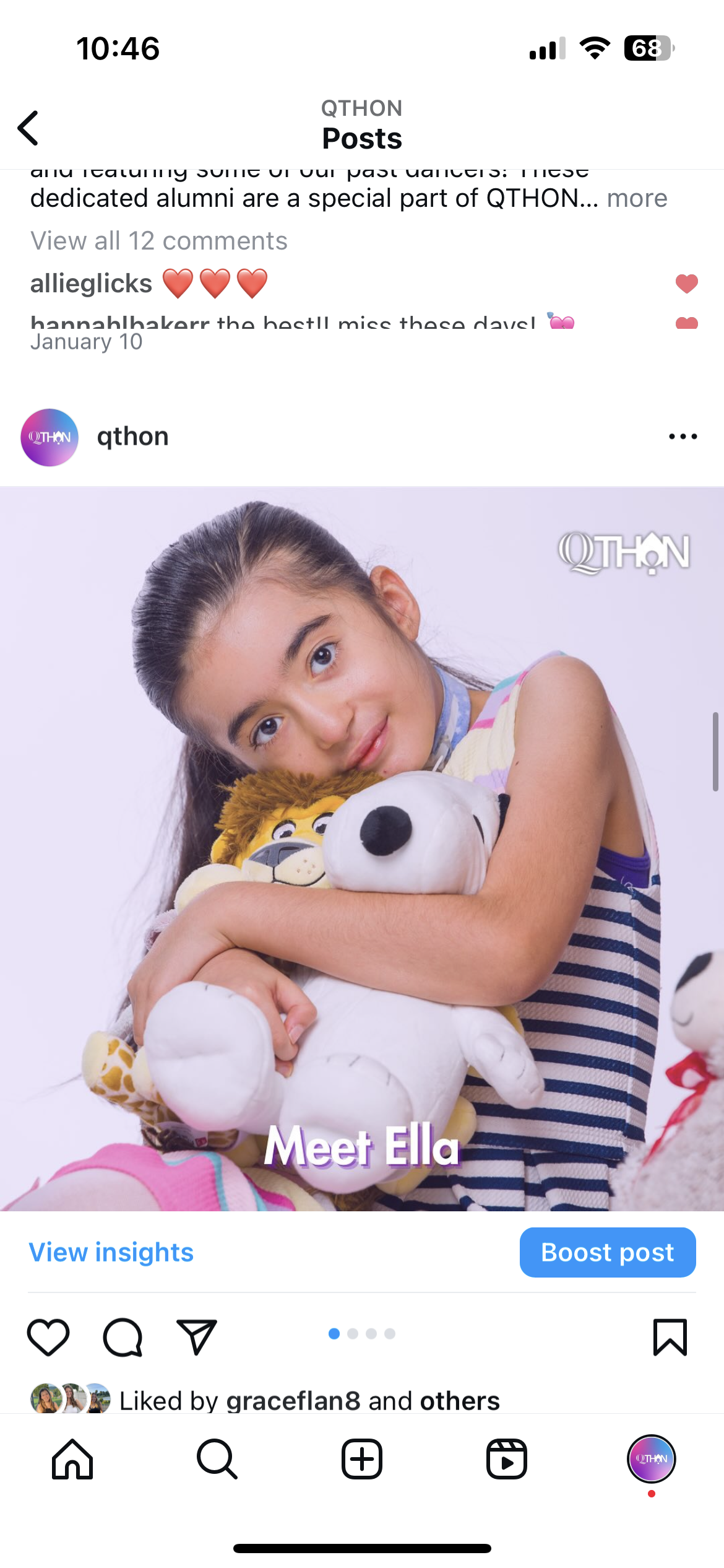
Basic Posts
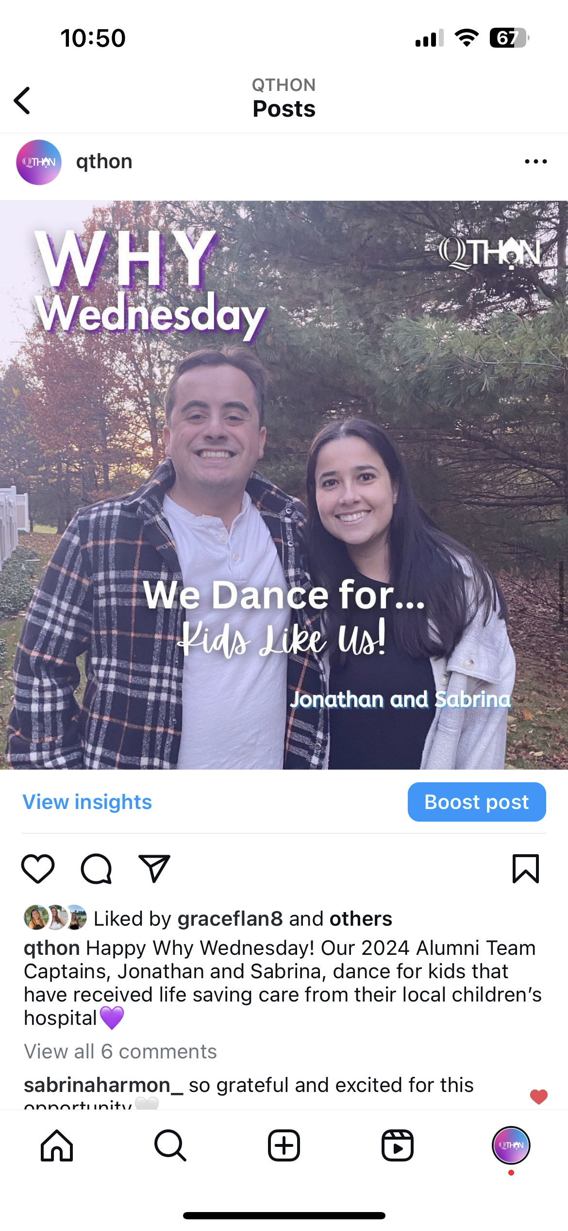
Why Wednesday
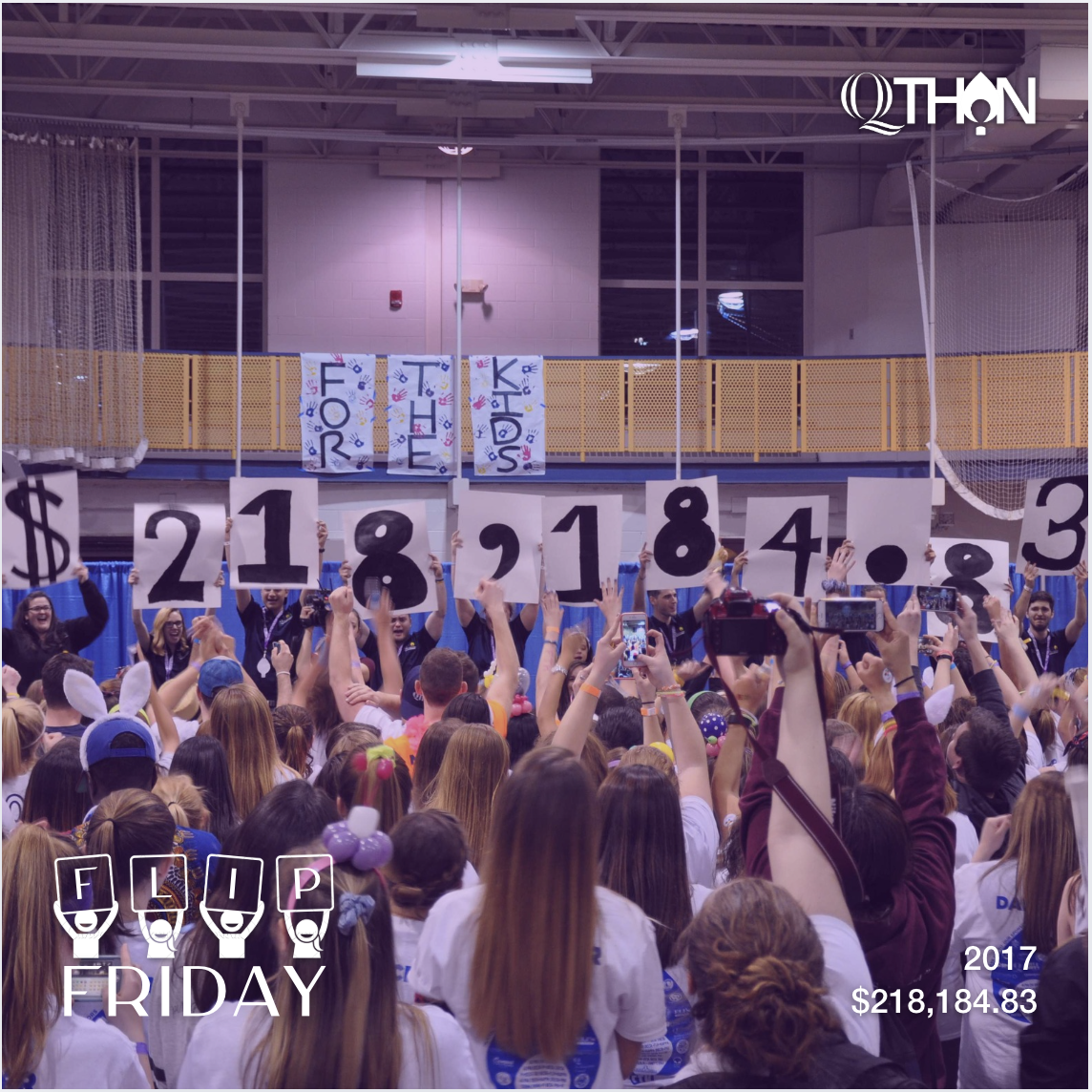
Flip Friday
The icon I made in Illustrator for our Flip Friday posts.
Pinned Posts
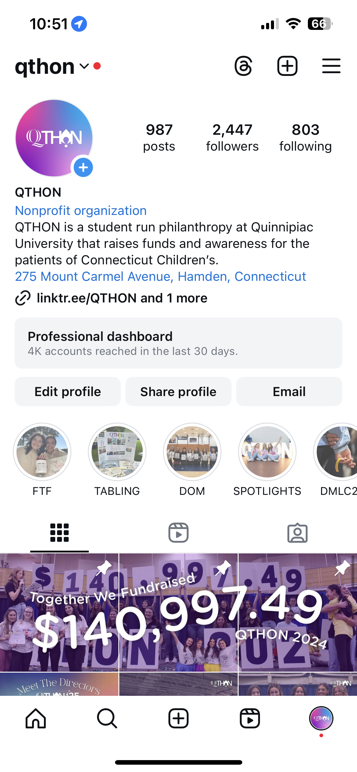
We utilized the pin feature to have cohesive posts at the top of our profile. I edited these in photoshop to ensure it aligned perfectly on our page.
Layout
Sketch
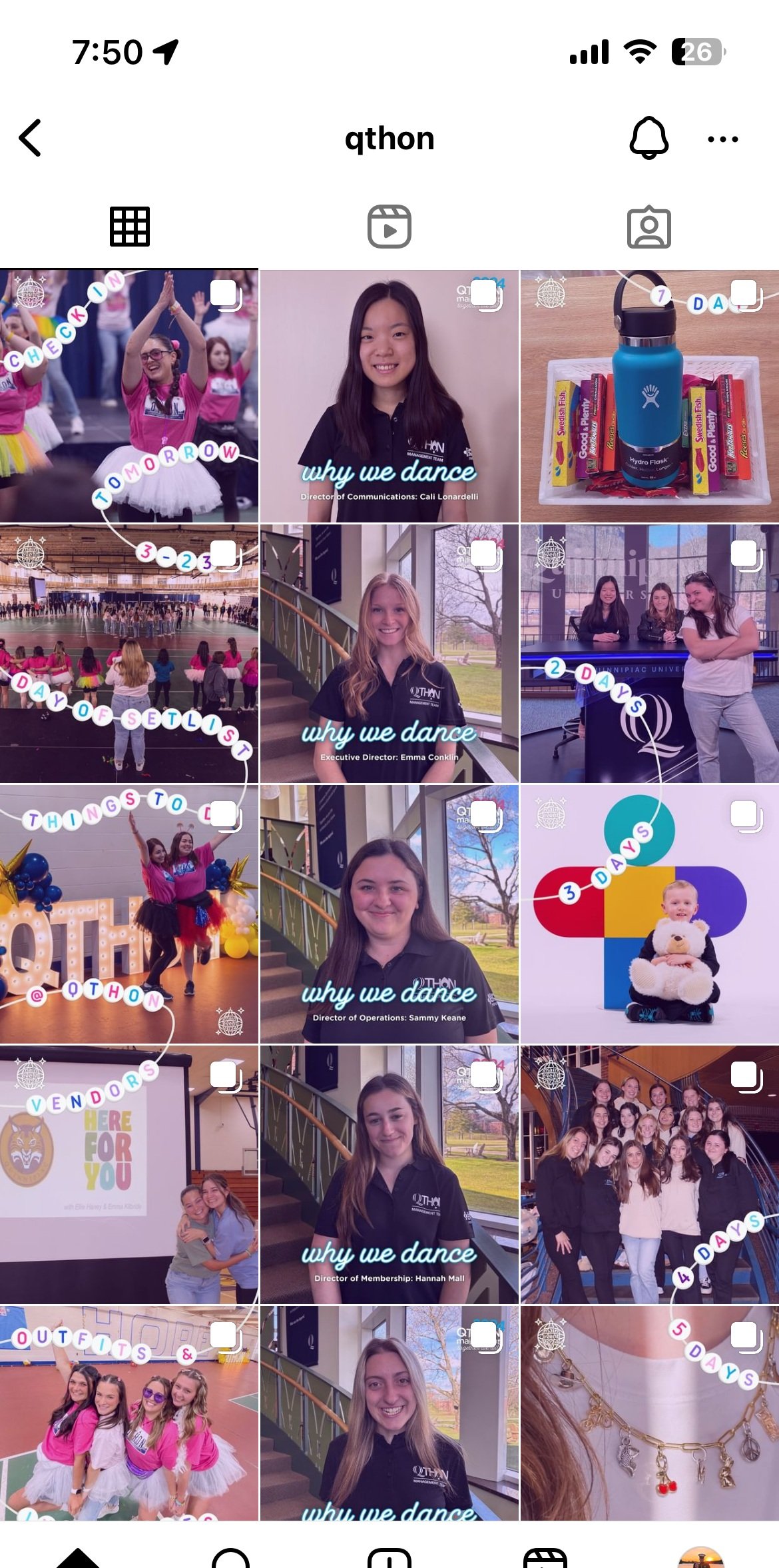
For the week leading up to our main event, we created a feed that fit together and matched our event’s theme which was inspired by Taylor Swift’s Era’s Tour.
Our Feed:
Each day we posted a countdown post (right column), a “why we dance” post (middle column) and an informational post (left column).
Outcome
Increased Instagram followers by 35.7% from April 2023 - March 2024
The number of content interactions from Jan 2024 - Apr 2024 was up by 272% compared to Oct 2023 - Jan 2024
The number of accounts engaged from Jan 2024 - Apr 2024 was up by 263% compared to Oct 2023 - Jan 2024
